Hi friends! Today I’m starting a new series called Distress Mixology. After receiving the Distress Paints from the Vault, I had so much fun playing with them but it made me realize that most of my makes are very similar in color palettes or that I use the same colors together over and over again. This series is a way for me to branch out using colors that I wouldn’t normally, for some reason, reach out and use. Do you find that there are colors in the Distress line that you gravitate to more often than others for no reason? Why do we choose those colors and why do we subconsciously skip others. That is the journey I’m on and hopefully this experiment will expand my color palette forcing me to try new colors. Hopefully, it will help me to mix colors I don’t normally think to mix and to work with a broader mixture of inks, oxides, sprays and paints instead of just pulling the inks off the shelf. I hope you find something new in this series and that it gives you the confidence to expand your color palette and mediums as well! Enjoy!
Distress Mixology No. 1 – Playing it Safe
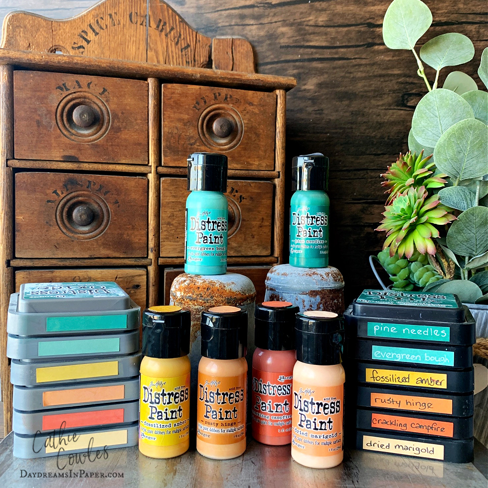
I decided to proceed safely with the first pick of colors. Some of these colors are ones I work with often like, Rusty Hinge (one of my favorites) and Fossilized Amber. Next, I decided to chose a couple of colors that I’ve used on occasion, Evergreen Bough and Crackling Campfire. Dried Marigold and Pine Needles were two picks that I hardly ever use and can almost say I never use. It’s a mystery to me as to why that is, because after working with them I realized how beautiful they really are. I discovered the muted and washed out tones of orange in Dried Marigold and the rich deep blueish tones of Pine Needles. It’s as if I just recieved two new colors of Distress!! Below, find my results with some thoughts I’ve had through the process and discoveries I’ve made by mixing these colors.
Inks Only
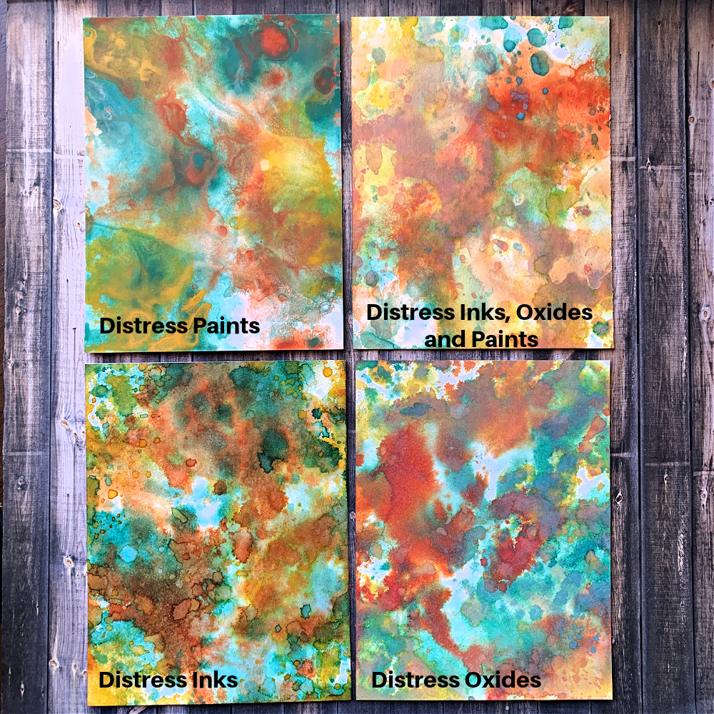
I decided to break down my experiments by using the same medium types with each other first. I used inks with inks, oxides with oxides and so forth. Then I chose two paints, two inks and lastly, two oxides. You can see the results below:
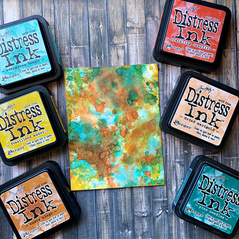
Distress Inks Only
This first sample is using the Distress Inks only. I chose all the colors of the palette; Pine Needles, Evergreen Bouth, Fossilized Amber, Dried Marigold, Rusty Hinge and Crackling Campfire.
I remembered to use colors together that wouldn’t produce mud and also to dry each layer before adding another one. I like the rich, vibrant colors of the inks and always have. I think that’s why I gravitate to them more often.
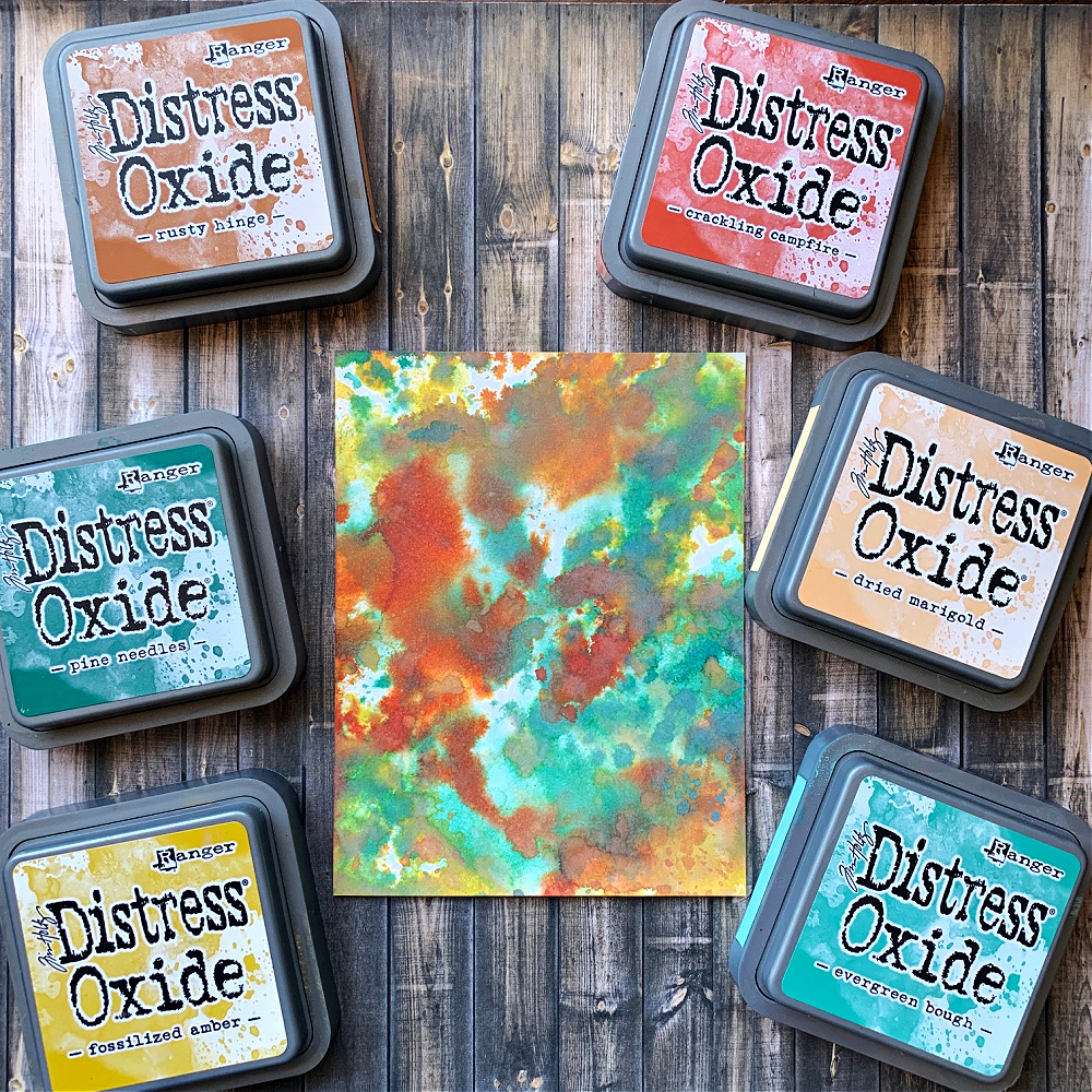
Distress Oxides Only
Next, I used all the colors of my palette using Oxides. These colors are more moody or mysterious to me in tone. I have to be honest, I never just use Oxides alone because I always feel like I’m looking at the colors without my glasses on. For me, it seems to be out of focus so when I use Distress Oxides, I always pair them with inks.
Distress Paints Only
Now it’s time to work with Distress Paints and I have to admit I’m in love. The way these paints flow when a little water is added is magical. It’s like a swirl of colors that just mesmerize you, isn’t it? It’s fun to see how some are more vibrant than others. I can’t wait to mix all three mediums, inks, oxides and paints and see the results.
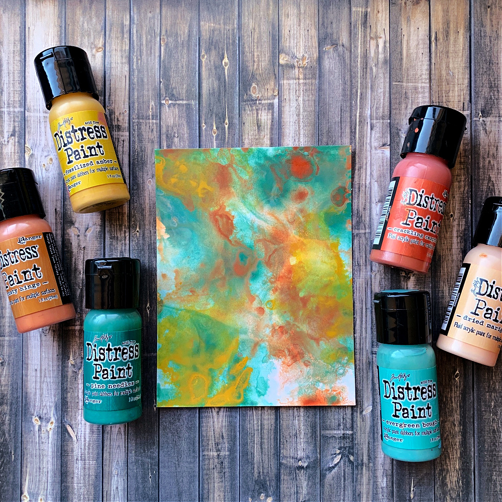
Distress Paints, Oxides and Inks Mixed
For this mixology experiment, I used Dried Marigold and Cracking Campfire Paints, Rusty Hinge and Pine Needles Oxides and Fossilized Amber and Evergreen Bough Inks. I started with the Paint and allowed that to completely dry. Then I moved on to the Oxides and then the Inks being sure to apply the colors one at a time and drying each layer before moving on to the next. I really like how this turned out. There are bright colors, muted colors and if you look hard enough, you can see the swirling paints in the far background.
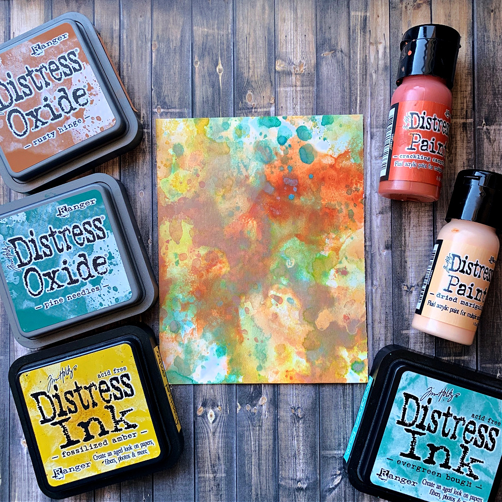
Overall Thoughts
I think I’ve been missing out on a world of beauty by failing to mix the Distress mediums which result in beautiful vibrant and muted colors with some hidden pops of color within. Stay tuned as I create something with this palette. Moving forward, I want to continue this pattern of creating mixtures of colors using different mediums and then creating something with that palette. I’m also going to venture into mixing colors of paints to create an entirely different color. Stay tuned and thanks so much for sticking with me to the end! I hope you have a colorful day!
You can find all the supplies I’ve used below:
Tim Holtz Ranger Distress Paint – Pine Needles
Tim Holtz Ranger Distress Paint – Dried Marigold
Tim Holtz Ranger Distress Paint – Evergreen Bough
Tim Holtz Ranger Distress Paint – Fossilized Amber
Tim Holtz Ranger Distress Paint – Crackling Campfire
Tim Holtz Ranger Distress Paint – Rusty Hinge



This post is fabulous and I will be pulling out my supplies to follow your lead. I sometimes shake my head at the beautiful colors in the line that just don’t get enough love. Thanks for the inspiration!!